Alex Wine
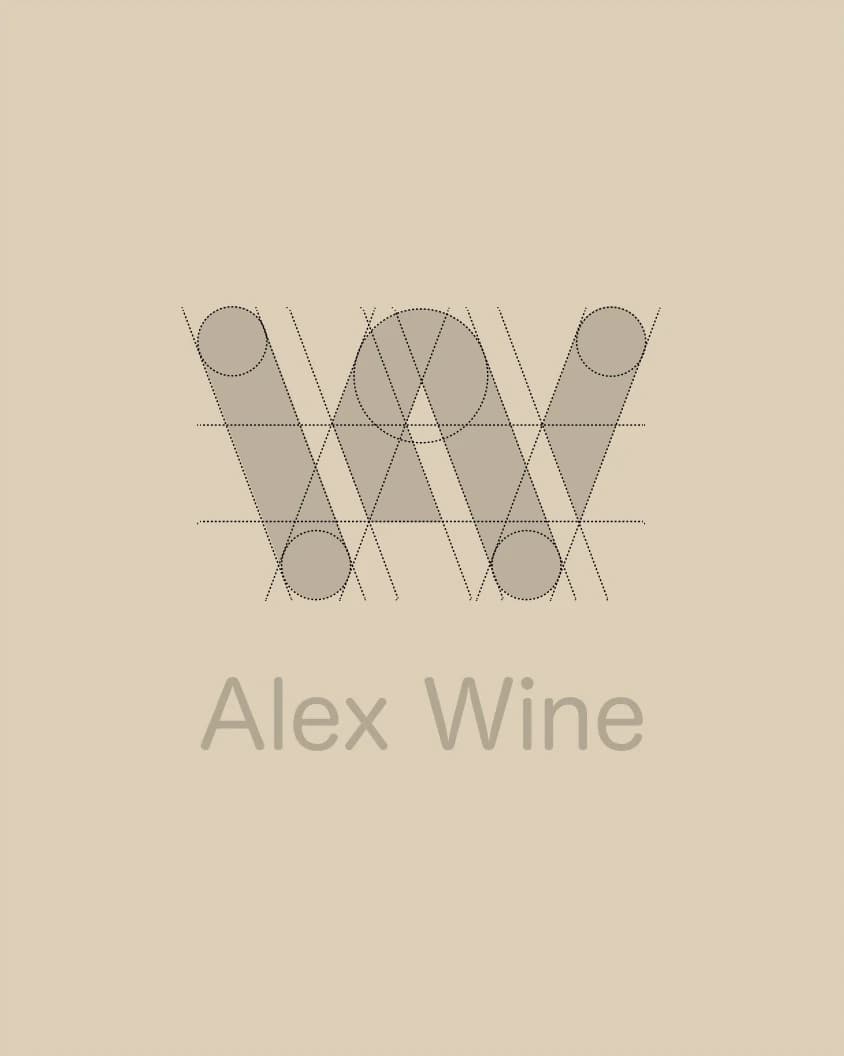
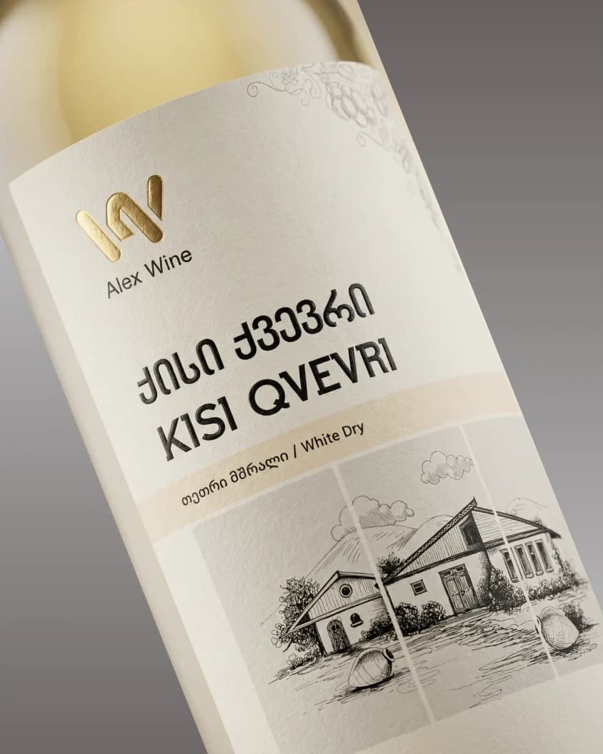
Alex Wine’s visual identity was developed by combining a clear monogram-based logo with a storytelling-driven label design, creating a cohesive and personal brand expression. The logo merges the initials A and W into a geometric, structured mark that reflects precision while maintaining a modern, clean, and distinctive character. This minimal and elegant direction was extended into the label, where the focus was on translating the brand’s personal story into a visual form.
The hand-built cellar — the place where the wine is crafted — was reimagined as a custom illustration, allowing the design to feel more unique and authentic. Print-focused details such as gold foil on the logo, carefully selected paper texture, and embossed accents enhance the final result, giving the label a refined and premium presence.