Orangy
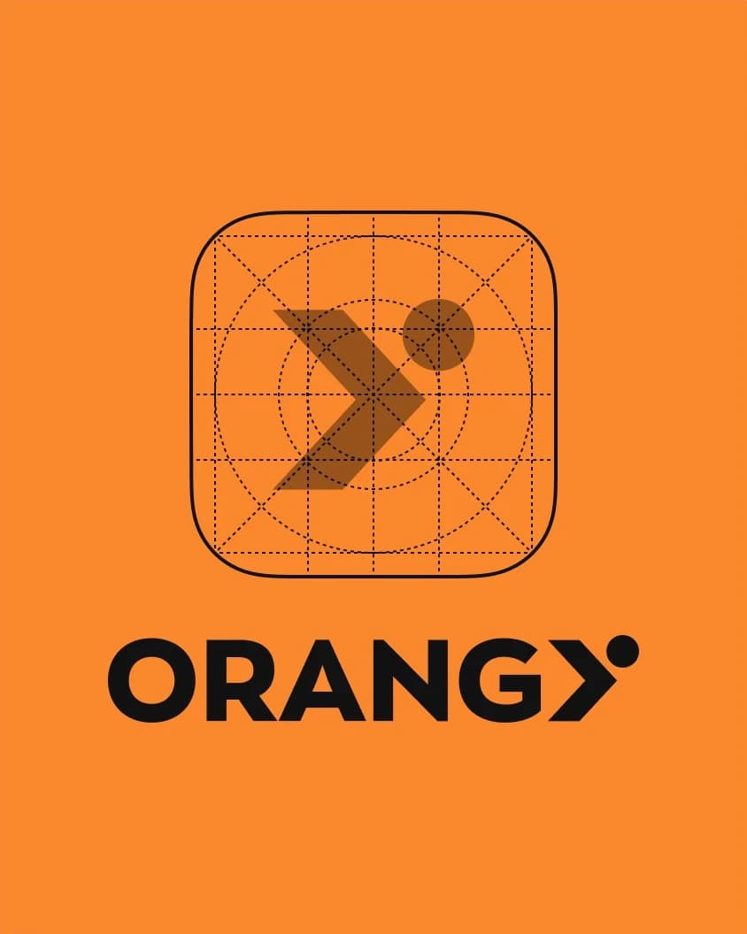
Orangy’s visual identity was created to reflect the brand’s active, dynamic, and modern character across both the logo and mobile app experience. Since the platform brings together gyms, trainers, and users within a single digital ecosystem, the overall design needed to communicate movement, energy, clarity, and direction in a way that feels both functional and memorable. The logo was built from a form inspired by athletic motion, resolving into the letter Y to create a simple, distinctive symbol closely tied to the brand name and meaning.
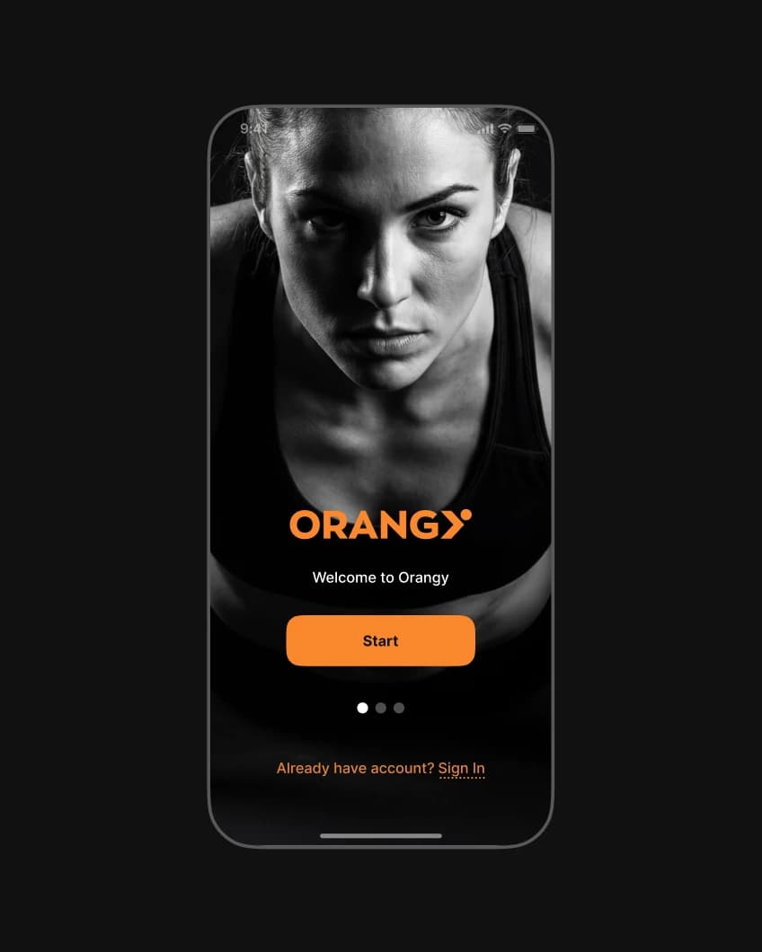
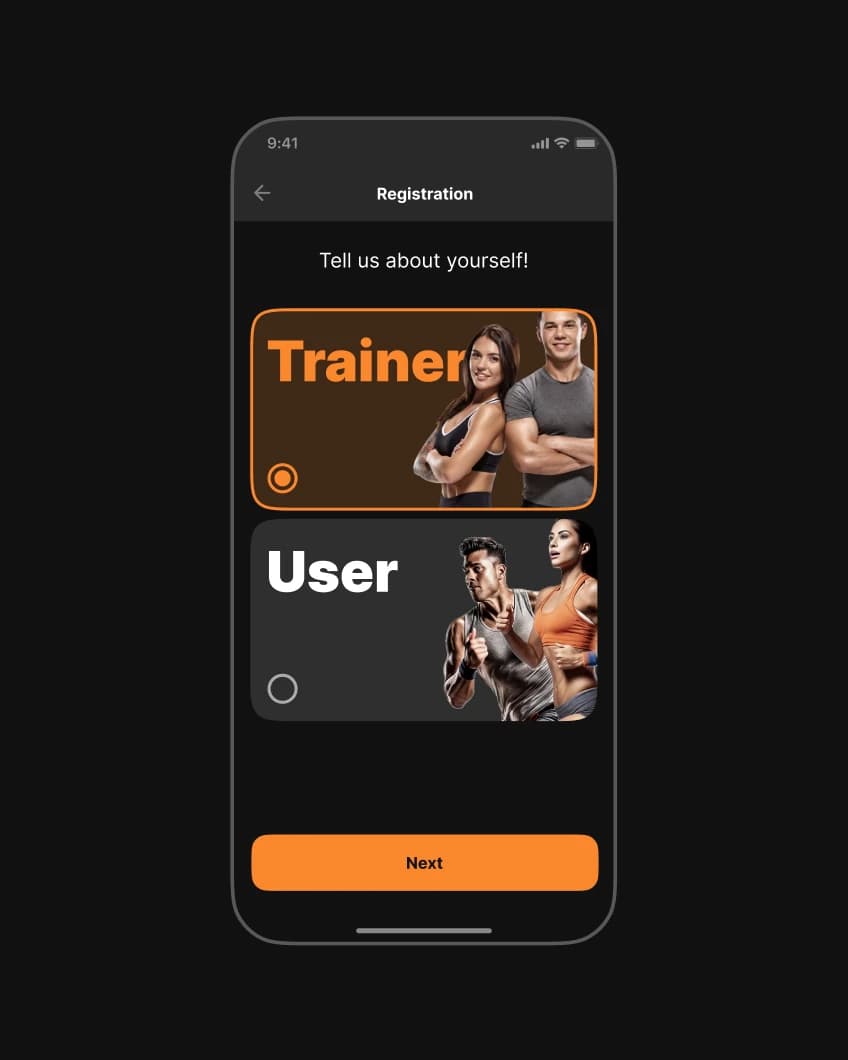
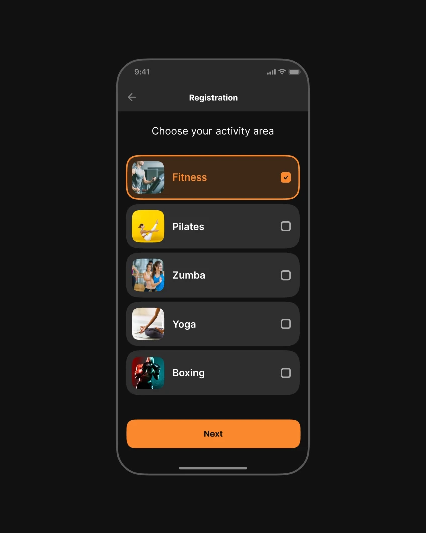
This direction was extended into the mobile product, where the app was designed to feel visually energetic, clear, and easy to use. Alongside the interface, a complete design system was developed — including color palette, typography, components, tokens, and other core elements — creating a scalable, consistent, and development-ready foundation for the product.