Wine&Co
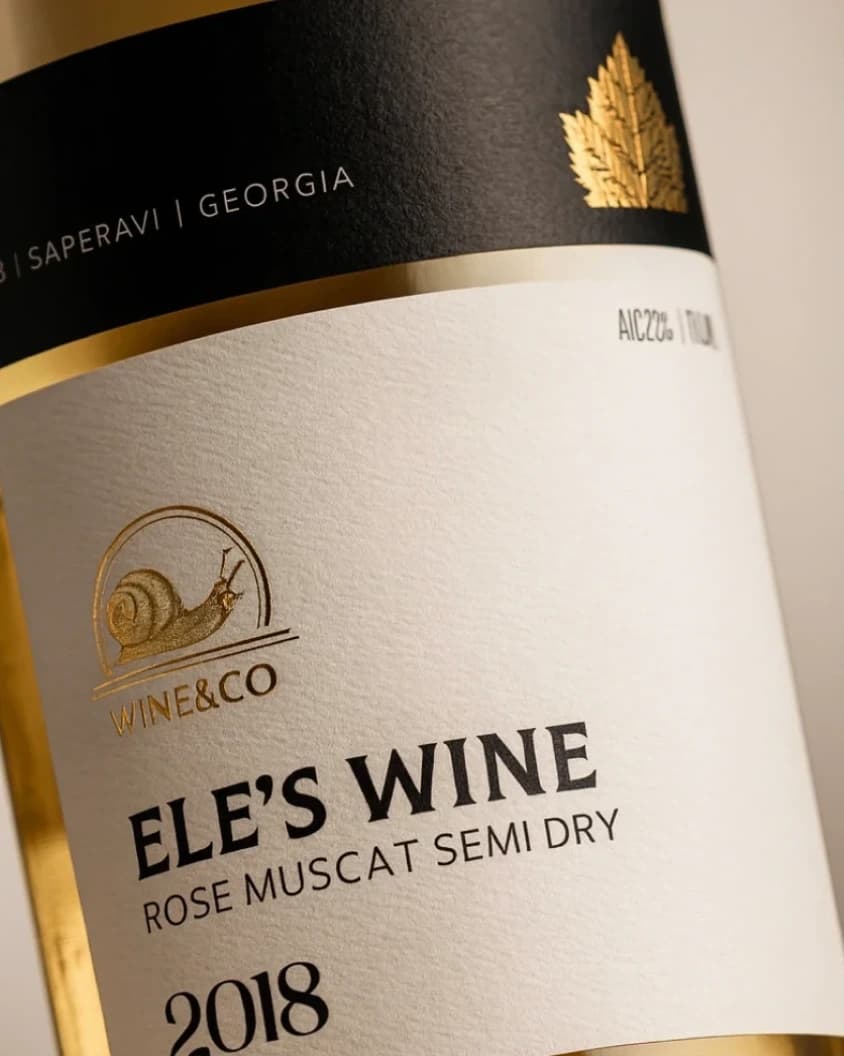
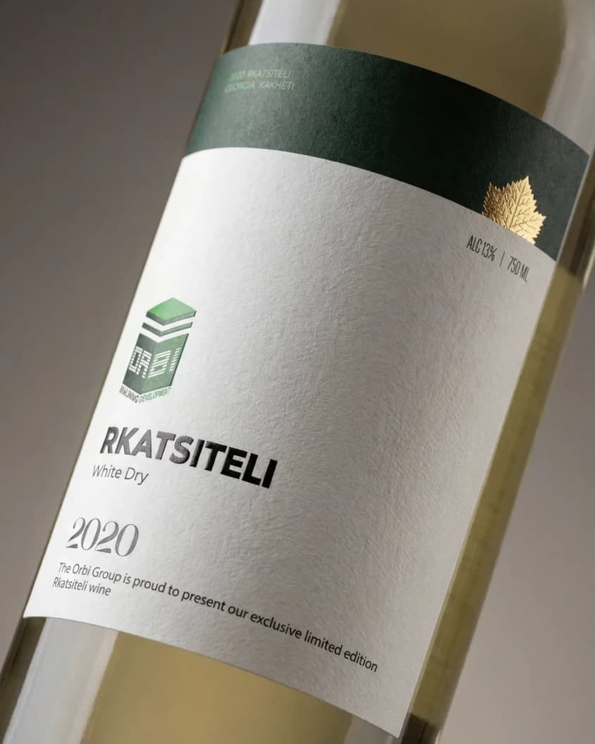
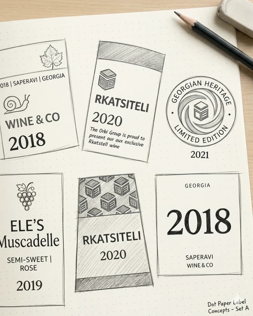
Wine&Co label designs were developed across two distinct contexts — a dedicated gift edition created for Orbi and a renewed visual direction for a commercial wine product — resulting in a cohesive yet flexible approach to the brand’s presentation. While the gift edition focused on a more formal, refined, and exclusive expression, the commercial label was designed to achieve a strong shelf presence with a premium, balanced, and visually clear identity.
Across both directions, the visual language relies on minimal structure, carefully balanced typography, subtle contrast, and understated premium details such as gold accents. The result is a polished and elegant system that adapts to different use cases while maintaining a consistent and memorable brand character.